O que aconteceria se designer digitais projetassem produtos físicos?
Essa é a proposta bem humorada do post abaixo.
In the past, when someone asked me what my profession was, I would usually say Product Designer. They would immediately ask me what kind of product. Furniture, airplanes, radios, headphones, sex toys? Embarrassed, I would clarify that I meant digital products—“you know, like websites and apps.” To which I would receive a look of confusion.
“I like to call those things products because they make me feel important. But usually, I just work with pixels and make-believe stuff,” I would further explain.
Now I just say I’m a designer.
This hasn’t avoided questions, though. I still have to clarify that no, I don’t design interiors, clothes, or lamps (but I would love to!)
I often wonder what would happen if I got to design physical products coming as a screen product designer. Would I follow the same human-centered process or would I try to design pixel-perfect chairs?
Here are some comics exploring this idea.
Note: After each image, there’s a text version of the comic. This is so that they’re a bit more accessible, in case you wonder why the redundancy.
Designing a Chair
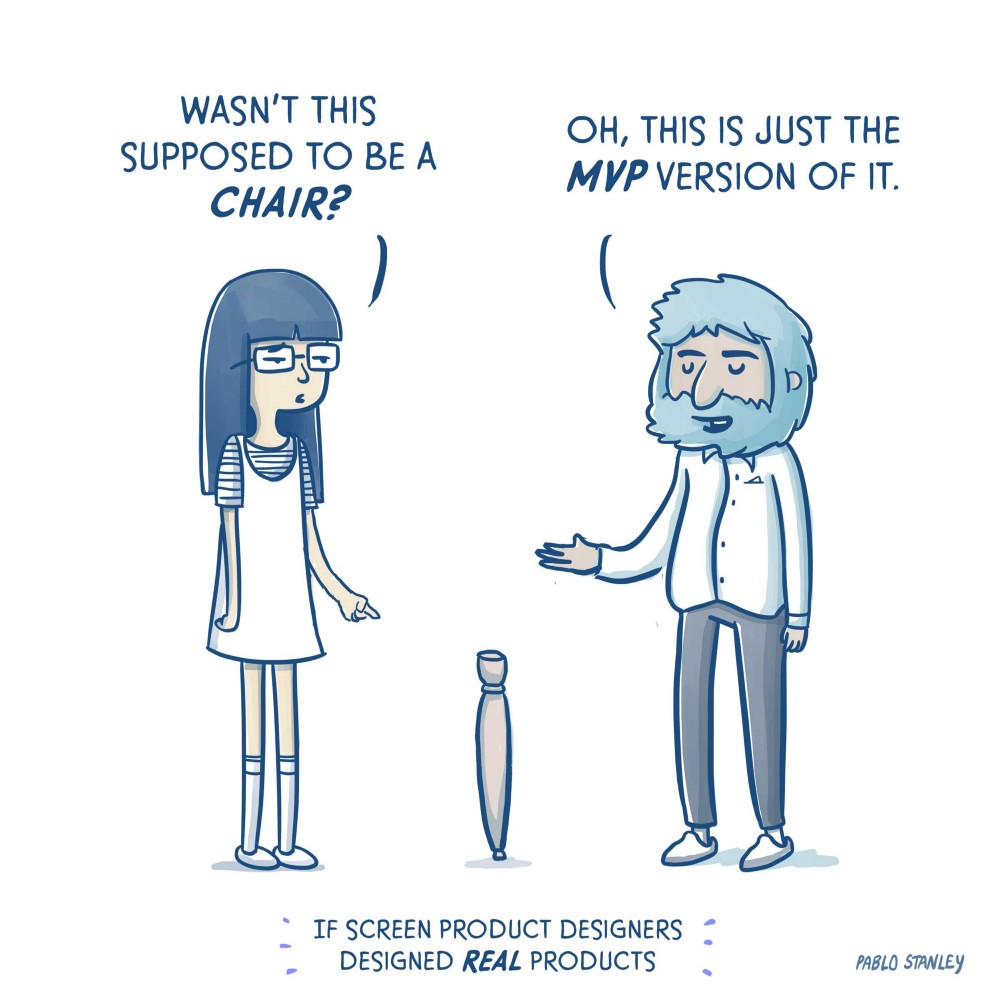
Frances and Paul stand next to each other. Between them there’s a wooden stick standing on the floor. Frances looks confused.
FRANCES: (Pointing at stick) Wasn’t this supposed to be a chair?
PAUL: Oh, this is just the MVP version of it.
Bicycle
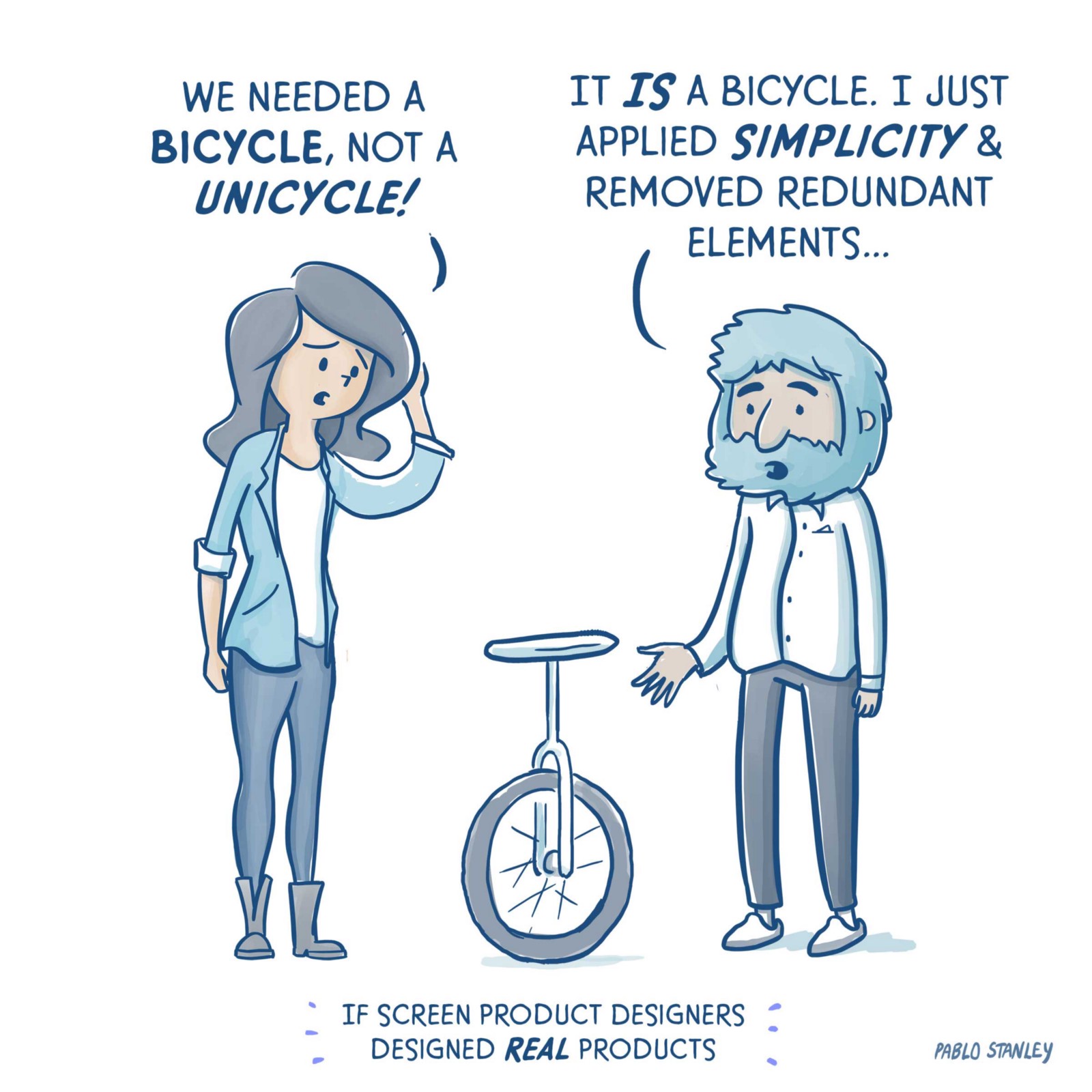
Petunia and Paul stand next to each other. Between them there’s what appears to be a unicycle. Petunia looks puzzled.
PETUNIA: (Scratching her head) We needed a bicycle, not a unicycle.
PAUL: It is a bicycle. I just applied simplicity and removed redundant elements.
Coffee Mug
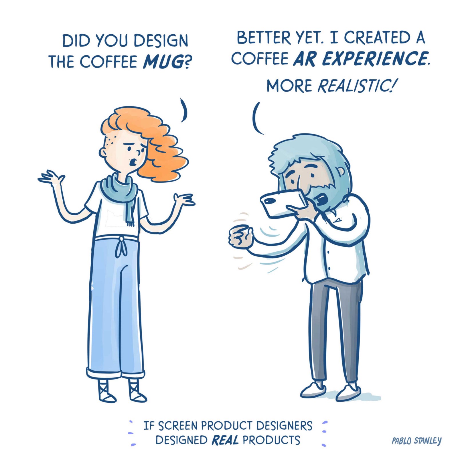
Gabs and Paul stand next to each other. Paul is holding a mobile screen near his face and is frantically moving his hand in front of him. Gabs seems upset.
GABS: Did you design the coffee mug?
PAUL: Better yet. I created a coffee AR experience. More realistic!
Table
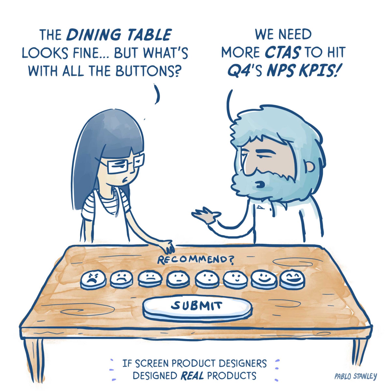
Frances and Paul stand next to a wooden table. The table has several buttons aligned horizontally. They have faces painted on them that go from angry to happy from left to right. Frances seems curious.
FRANCES: The dining table looks fine… but what’s with all the buttons?
PAUL: We need more CTAs to hit Q4’s NPS KPIs!
Guitar
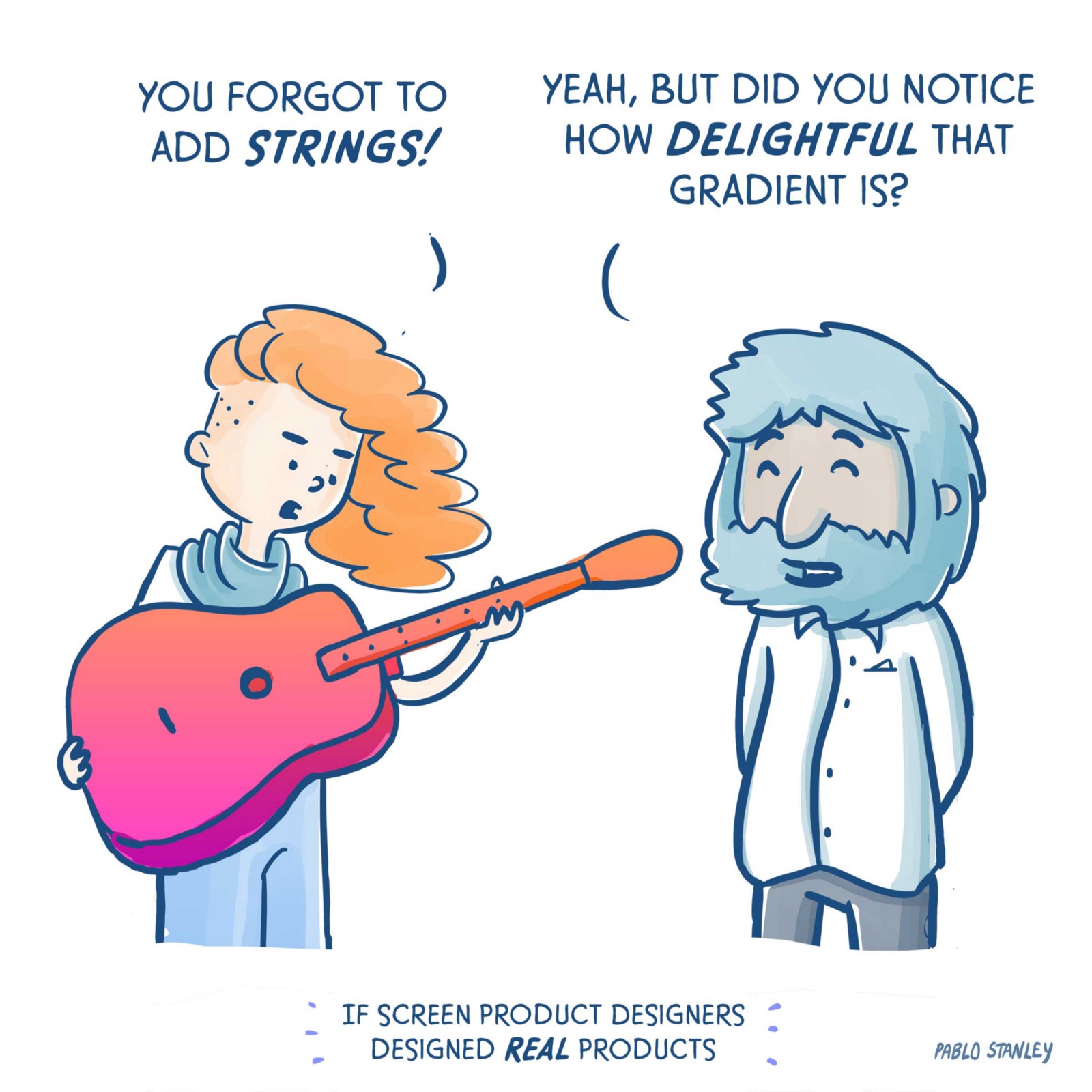
Gabs is holding an odd guitar with a special coat of color. Paul seems giddy. Gabs looks annoyed.
GABS: You forgot to add strings!
PAUL: Yeah, but did you notice how delightful that gradient is?

Hola, amigxs. I’m Pablo Stanley, designer at InVision.
I usually post comics and design-related things on Twitter. Follow me if you’re into that stuff.
I also have a YouTube channel called Sketch Together with tons of design tutorials and livestreams.
Lumen Bigott and I have a design podcast in Spanish called Diseño Cha Cha Cha in which we interview creative latinxs working in tech.
Un fuerte abrazo. (FROM MEDIUM)
INTERESSADO EM CURSOS DE UX E UI?
VEJA ESTAS OFERTAS EXCLUSIVAS:
1) Curso de UX - Básico ao intermediário
2) Curso Online de User Interface Design


Nenhum comentário :
Postar um comentário